this post was submitted on 21 Jan 2024
958 points (97.4% liked)

Mildly Infuriating

35578 readers
704 users here now

Home to all things "Mildly Infuriating" Not infuriating, not enraging. Mildly Infuriating. All posts should reflect that.

I want my day mildly ruined, not completely ruined. Please remember to refrain from reposting old content. If you post a post from reddit it is good practice to include a link and credit the OP. I'm not about stealing content!

It's just good to get something in this website for casual viewing whilst refreshing original content is added overtime.


Rules:

1. Be Respectful


Refrain from using harmful language pertaining to a protected characteristic: e.g. race, gender, sexuality, disability or religion.

Refrain from being argumentative when responding or commenting to posts/replies. Personal attacks are not welcome here.

...


2. No Illegal Content


Content that violates the law. Any post/comment found to be in breach of common law will be removed and given to the authorities if required.

That means: -No promoting violence/threats against any individuals

-No CSA content or Revenge Porn

-No sharing private/personal information (Doxxing)

...


3. No Spam


Posting the same post, no matter the intent is against the rules.

-If you have posted content, please refrain from re-posting said content within this community.

-Do not spam posts with intent to harass, annoy, bully, advertise, scam or harm this community.

-No posting Scams/Advertisements/Phishing Links/IP Grabbers

-No Bots, Bots will be banned from the community.

...


4. No Porn/ExplicitContent


-Do not post explicit content. Lemmy.World is not the instance for NSFW content.

-Do not post Gore or Shock Content.

...


5. No Enciting Harassment,Brigading, Doxxing or Witch Hunts


-Do not Brigade other Communities

-No calls to action against other communities/users within Lemmy or outside of Lemmy.

-No Witch Hunts against users/communities.

-No content that harasses members within or outside of the community.

...


6. NSFW should be behind NSFW tags.


-Content that is NSFW should be behind NSFW tags.

-Content that might be distressing should be kept behind NSFW tags.

...


7. Content should match the theme of this community.


-Content should be Mildly infuriating.

-At this time we permit content that is infuriating until an infuriating community is made available.

...


8. Reposting of Reddit content is permitted, try to credit the OC.


-Please consider crediting the OC when reposting content. A name of the user or a link to the original post is sufficient.

...

...


Also check out:

Partnered Communities:

1.Lemmy Review

2.Lemmy Be Wholesome

3.Lemmy Shitpost

4.No Stupid Questions

5.You Should Know

6.Credible Defense


Reach out to LillianVS for inclusion on the sidebar.

All communities included on the sidebar are to be made in compliance with the instance rules.

founded 1 year ago
MODERATORS
 
top 50 comments
sorted by: hot top controversial new old
[–] natecox@programming.dev 170 points 10 months ago (6 children)

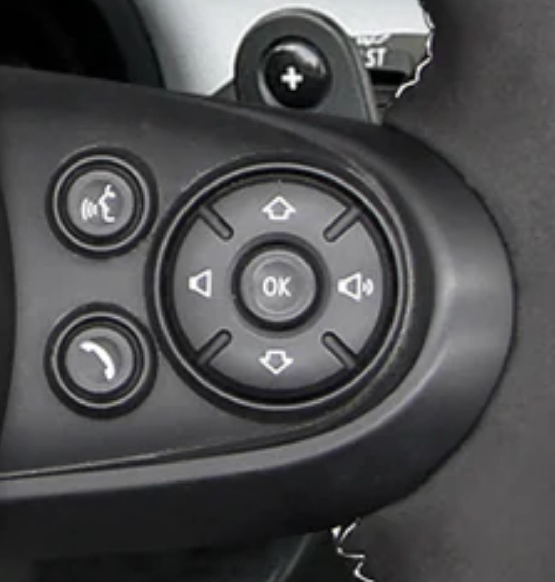
This layout makes sense if you have used an old school mp3 player or similar.

Volume is left and right because it’s an analog of the volume bar on the screen.

Up and down is previous and next because play was controlled by a list UI so you were moving a cursor up and down between songs.

It’s not how I personally would prefer it, but it’s not as outlandish as it seems.

[–] Ghostalmedia@lemmy.world 81 points 10 months ago

That makes a lot of sense. I still hate it, but i understand the justification for it now.

[–] kautau@lemmy.world 16 points 10 months ago

Probably also matches to a visible screen with track visibility, so up and down is literally moving between tracks

[–] chuckleslord@lemmy.world 9 points 10 months ago

The up and down, in this case, also correspond with how the menus work on the HUD or Center control panel. Source, MINI owner since 2009.

load more comments (3 replies)
[–] lipilee@feddit.nl 81 points 10 months ago (1 children)

Hey, at least it's not a touch screen :)

[–] andrew_bidlaw@sh.itjust.works 34 points 10 months ago (4 children)

Nailed it. Even the worst interface with buttons is miles away from the best touchscreen interface. You are like driving, you aren't supposed to look at the screen and tap things on it to switch a song or whatever. You navigate a missile that weights at least two tones and can undo a crowd of pedestrians or break a wall in a building. You are in no position to focus on this tiny LED that some insane idiot mounted there. Yet, it's there.

load more comments (4 replies)
[–] Ghostalmedia@lemmy.world 54 points 10 months ago (1 children)

My wife just reminded me that she was asked to take a survey about this car after she bought it.

She complained about these buttons being oriented stupidly, and the survey taker mentioned that this has been a common complaint for years. Nevertheless, BMW / Mini has stayed the course. Users be damned.

[–] JackiesFridge@lemmy.world 14 points 10 months ago (1 children)

Begs the question - what exactly is the survey for, then?

[–] iAvicenna@lemmy.world 9 points 10 months ago (1 children)

probably crowd sourcing tests for more critical errors.

"did your car suddenly stop while going at 90 mph?"

[–] JackiesFridge@lemmy.world 6 points 10 months ago (1 children)

"When was the last time your car spontaneously combusted? Please rate the level of inconvenience."

load more comments (1 replies)
[–] duckmilk@lemmy.world 39 points 10 months ago

The speak-button looks like a farting stick-figure.

[–] rabiddolphin@lemmy.world 37 points 10 months ago (3 children)

Ampersands on Lemmy, mildly infuriating

[–] Threeme2189@lemm.ee 10 points 10 months ago
load more comments (2 replies)
[–] chiliedogg@lemmy.world 27 points 10 months ago (9 children)

I want to know why do many cars don't have a play/pause button on the wheel, but do have a source button.

I change my source from my phone exactly never. I want to pause the audio all the time.

[–] Hadriscus@lemm.ee 9 points 10 months ago

bro I swear whoever designs the interfaces in cars must be the CEO's nephew

load more comments (8 replies)
[–] Couldbealeotard@lemmy.world 25 points 10 months ago (5 children)

Drove a Kia once and it was the same. Up went back a track, down went forwards. Opposite of my intuition.

load more comments (5 replies)
[–] niktemadur@lemmy.world 22 points 10 months ago (3 children)

Yet one more item in an endless exhibit of how mankind is unable to standardize anything at all. Get TWO engineers together to agree on ONE standard plug and the assholes will come out with THREE separate plugs, completely non-compatible with each other, of course.

It's almost like a miracle that we got the world to agree on certain things like time and timezones, a system of coordinates, the metric system.
All of them received initial pushback, and some to this day. Noisy, noisy fucking humans.

Did you know that for a few decades, every town in the UK kept two different times on adjacent clocks? Back when their railway grid was expanding everywhere. Local time and London time.

[–] DokPsy@infosec.pub 21 points 10 months ago (3 children)

Funny enough, it's not the engineers that are doing it. Left to their own devices without ridiculous constraints like "someone else is doing it this way so we need you to do something that sets us apart" or "you can't look at what everyone else is doing", engineers will do it the laziest way they can..... By copying what others are doing and essentially making it standard.

[–] zalgotext@sh.itjust.works 11 points 10 months ago

Yeah usually when engineers take extra effort to do something non-standard, it's at a specific request from a client or management

load more comments (2 replies)
[–] toiletobserver@lemmy.world 17 points 10 months ago (1 children)

Wouldn't it be nice if an engineer had decision making power?

[–] DemBoSain@midwest.social 17 points 10 months ago (6 children)

Engineer here. It's like that because that's the way it's always been. To change it would mean retooling silk-screen printing on the D-pad, and changing the wiring underneath. And they probably use this D-pad everywhere, so someone like me will have to talk to someone else like me, and right now I have phone shyness (can't just be an email, have to call a meeting). I'll also have to talk to a supplier and get them to change the wiring, and Procurement won't let me just change anything, because it gives suppliers a chance to requote a job, and they'll ask for more money. And then I'll have to talk to Production, because they'll have to retrain the workers, make sure someone doesn't stop the line because this new part doesn't look exactly like the old part. Oh, and Quality of course, need to make sure the inspectors don't start rejecting the new parts (just kidding, they never look at parts). Then there's Marketing. Since this is a customer-facing part, definitely need their input. Might have to change catalogs and brochures with new pictures.

No, they just got the good brand of gummy bears in the cafeteria, I'm going to go buy a bag of those, and then fill out these forms my new boss has been asking about. New boss, new forms, same old shit.

[–] Fermion@feddit.nl 6 points 10 months ago

Remapping gpio pins doesn't require changing wiring, but it might require tracking a unique firmware revision.

load more comments (5 replies)
[–] uranibaba@lemmy.world 16 points 10 months ago (1 children)

The designer of this layout look at the display, saw that the volume slider was going left/right and placed the buttons accordingly (probably what happened).

[–] hownowbrowncow@lemmy.world 7 points 10 months ago (1 children)

This and radio channels/tracks are presented in a list on modern displays. "Down" is the next item.

load more comments (1 replies)
[–] Rememo@kbin.social 15 points 10 months ago (1 children)

Same in my 2017 Toyota. Bought it new and trained my brain to use it. Someone finally released a replacement that's set up correctly, and now I'm relearning the control.

load more comments (1 replies)
[–] Swaziboy@lemmy.world 15 points 10 months ago

Preach! When did you ever hear someone say "please turn the volume right" or "can you play the up track"? It drives (NPI) me crazy in my Toyotas!

[–] weiln12@lemmy.world 14 points 10 months ago (6 children)

My VW is this way and it’s infuriating. It drives me nuts that Down is Next, it’s so backwards.

Volume should be up/down, and track left/right.

I’m curious if the left/right would be language dependent? English is left to right, so Right would be Next. Would Hebrew and Arabic be the opposite since they’re right to left languages?

load more comments (6 replies)
[–] 1rre@discuss.tchncs.de 14 points 10 months ago* (last edited 10 months ago)

I drove this make of car for a while; there's an optional head up display where the up and down buttons here let you cycle through contacts/the song queue/radio stations. I'd imagine it's the same interface without it, just displayed somewhere in the car where you're not looking while driving.

Having it so that up/down moves you up/down through the list when there's a visual display is way more intuitive than up/down being volume - frankly the volume bar on Windows, Mac, many TVs etc. goes from left (quiet) to right (loud) anyway

[–] Crow@lemmy.world 14 points 10 months ago (1 children)

Think of it like this. Up arrow is forward and the down arrow is back. The volume then increases from left to right like most linear scales (that aren’t up and down). Yes the buttons should be the other way but there was probably some (poor) reasoning to why they are this way.

[–] Ghostalmedia@lemmy.world 20 points 10 months ago

As someone mentioned in the comments, it might be because the media is displayed as a vertical list on the car’s display.

[–] Badeendje@lemmy.world 13 points 10 months ago

Made by people that use a volume slider and swipe for next... Such a horrible design in cars.

[–] Appoxo@lemmy.dbzer0.com 13 points 10 months ago

This is a Mini Cooper steering wheel.

[–] nezbyte@lemmy.world 12 points 10 months ago (5 children)

The up and down are used to go up and down in menus lists. It matches the animations as well. It would be infuriating if those buttons were on the horizontal.

load more comments (5 replies)
[–] circuitfarmer@lemmy.sdf.org 12 points 10 months ago* (last edited 10 months ago) (1 children)

Clearly you're meant to have the car on its side before playing any media

[–] Ghostalmedia@lemmy.world 6 points 10 months ago (3 children)
load more comments (3 replies)
[–] NightAuthor@lemmy.world 11 points 10 months ago (3 children)

So my question is, which is next: up or down?

load more comments (3 replies)
[–] piranhaphish@lemmy.world 10 points 10 months ago (2 children)

My pet peeve has always been when media controls (like volume) are on the right side of the steering wheel rather than the left.

To me it makes a lot less sense to put them on the right when my right hand is already 10 inches away from another set of media controls (left-hand drive vehicle).

My 2004 Mazda, 2018 Mazda, and 2011 Kia all had it figured out and pretty much used the same layout for media controls and accessories like cruise control. My Ford, however, seems like no thought was put into it.

load more comments (2 replies)
[–] Buffalox@lemmy.world 9 points 10 months ago

Return the car, it's obviously built by morons.

[–] realitista@lemmy.world 8 points 10 months ago (9 children)

Fellow Mini owner. This is only one of the many questionable UI decisions made in my car. I literally had to get help to get it started the first time.

load more comments (9 replies)
[–] MrScottyTay@sh.itjust.works 8 points 10 months ago (1 children)

If you're turning left, they'll be correct

load more comments (1 replies)
[–] Resol@lemmy.world 8 points 10 months ago

This is actually exactly how my telly remote works. Left and right are volume down and up respectively, up and down are next channel and previous channel respectively.

[–] scytale@lemm.ee 8 points 10 months ago (1 children)

Name and shame. What make and model?

[–] Ghostalmedia@lemmy.world 13 points 10 months ago (2 children)

Mini Cooper S. Been a Mini thing for years. It’s infuriating.

load more comments (2 replies)
[–] kamen@lemmy.world 7 points 10 months ago (2 children)

Rotate the ~~controls~~ the whole car 90 degrees CCW.

load more comments (2 replies)
[–] curiousaur@reddthat.com 7 points 10 months ago (2 children)
load more comments (2 replies)
[–] tigeruppercut@lemmy.zip 7 points 10 months ago (3 children)

My folks had a Volvo where the radio had 2 knobs and two buttons with arrows. One knob was volume, makes sense. The other knob and arrow buttons controlled the radio tuner and the thing to switch inputs from radio to cd to usb or whatever.

So on one hand you've got radio channels with about a hundred different options (90.1, 90.3, 90.5, etc), and on the other hand you've got maybe 5 different inputs. Guess which thing the knob controlled.

load more comments (3 replies)
[–] AA5B@lemmy.world 7 points 10 months ago

At least you have those ridges dividing the directions. My car has similar but oriented correctly and no ridges. All too often I skip to next when trying to increase volume. It’s really annoying

[–] Pirasp@lemmy.world 6 points 10 months ago

Makes perfect sense while you are holding a stick drift!

load more comments
view more: next ›