Great you understood. I want it to be as universal as possible and part of that is no English text explaining stuff. Anyway, I’ve thought of that too. It would be a bit of work to make sure it looks good, but definitely an option in the future.
Crow
joined 2 years ago
I plan to add an extra size for larger scaling that will have thinner lines.
This is very intriguing. I’ve been testing it and it seems good, but maybe I’m not looking for the right thing. Care to explain what you mean?
They are all vectors so the scaling is good. I don’t have larger variants for folders and mimetypes but that’s planned in the future.
With the icons I’m releasing an “unfilled set”. And I have tediously made sure all my icons are single layer proper svg files without any styles or unnecessary metadata and no strokes. That way it’s super easy to run batch commands on the whole set. Say you wanna replace a colour, do a find and replace and command, it’s that’s simple. So for chaos you could just make a script to keep changing the fill as it goes through every icon.
The bottom row is meant to show that the theme changes to the used accent colour. Should I make that more clear?
So I recently redid a full system icon pack based on/ using the open source material design icons from google. I wanted to have an icon pack that could completely adapt my whole system to any colour I wanted, and ended up having to make my own.
I shared this recently here.
I’m releasing it very soon, and would love some ideas or tips I should consider in the last moments before I submit the finished first release?
So far I know I need many more app icons, but other than that would love some ideas/ tips. Thanks.
(I’d love a list of app names I need to name the app icons to so they automatically apply.)

They are all svg files, all with proper plasma theming. Well some, I will have a standard and coloured versions.
Probably. It’s a super simple splash. Should be easy to modify.
I was having some issues figuring out why it wasn’t working 😅. Thought if anyone downloaded the broken ones this would be the message they would want to see.
Can’t steal it if it’s free.
Any idea on the original source?
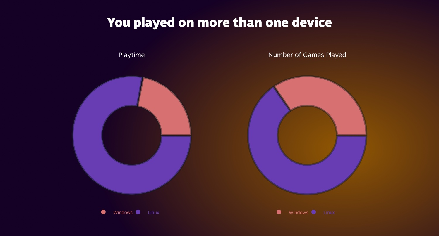
I took the dive into Linux gaming at the start of the year and never switched back to windows. It’s so much better for everything and Steams work on big picture has let me turn my PC into the Linux console of my dreams since the steam machine vaporware days.
Additionally the ease of use of using Linux vs windows for gaming has gotten me to start using my pc for local coop a lot more. I’ve had so much more success using multiple controllers with Linux than windows.
My biggest worry, like anyone’s, was that I would feel limited by the games I can play. I’ve honestly started to try even more games since I’ve had better experiences with switch emulators on Linux (Yuzu my baby). Sometimes a newer game won’t let me use the latest version of DLSS my GPU supports but that doesn’t make a game unplayable, I just don’t get max graphics/ performance.
The only game I can’t play is rocket league. But I can only blame Epic for actively breaking the game on Linux.
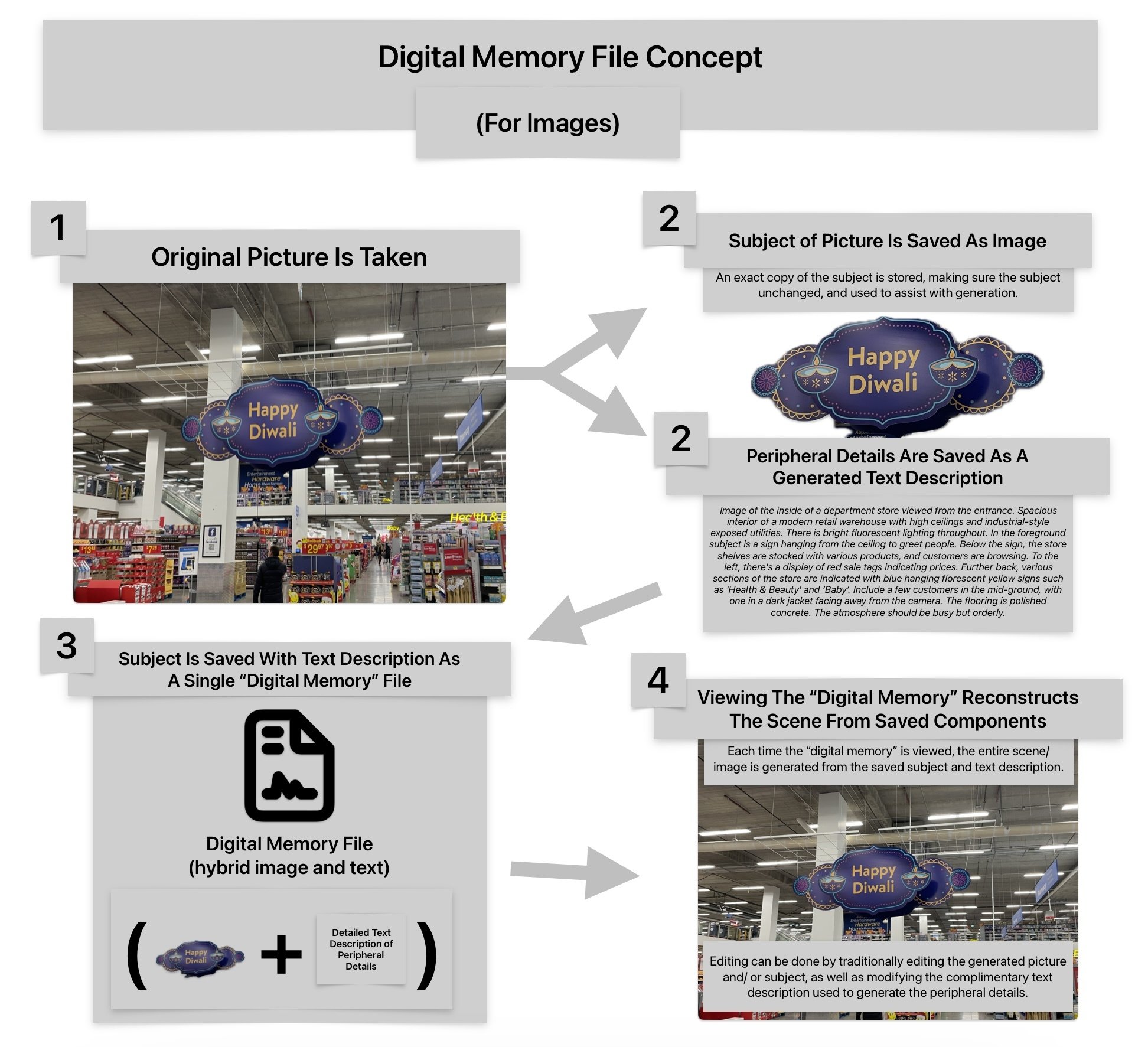
This is an idea I’ve been toying with for a bit. There is a ton of media that includes unimportant information that doesn’t need to be stored pixel perfect. Storing large portions of the image data as text will save substantial amounts of storage, and as the reality of on-device image generation becoming commonplace sets in digital memories will become the main way people capture the world around them. I think this will inevitably be the next form of media capture (photography and video), not replacing other methods/ formats, but I could see things like phone cameras having saving images as digital memories set to default to save on storage.
view more: next ›
Well that’s embarrassing. My brain is a bit melted after a month straight of making and organizing icons.