this post was submitted on 22 Dec 2023
431 points (98.2% liked)
Climate - truthful information about climate, related activism and politics.
7460 readers
305 users here now
Discussion of climate, how it is changing, activism around that, the politics, and the energy systems change we need in order to stabilize things.
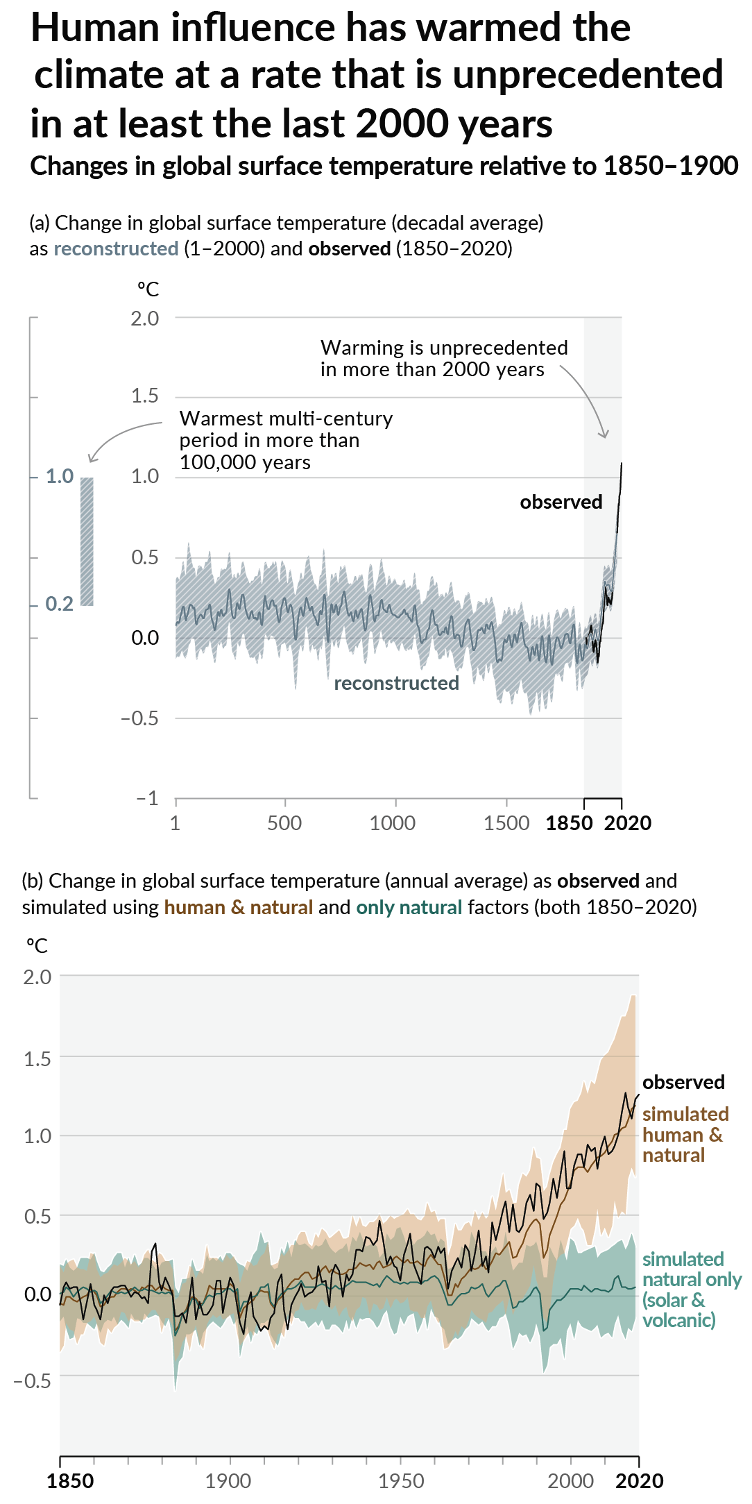
As a starting point, the burning of fossil fuels, and to a lesser extent deforestation and release of methane are responsible for the warming in recent decades:

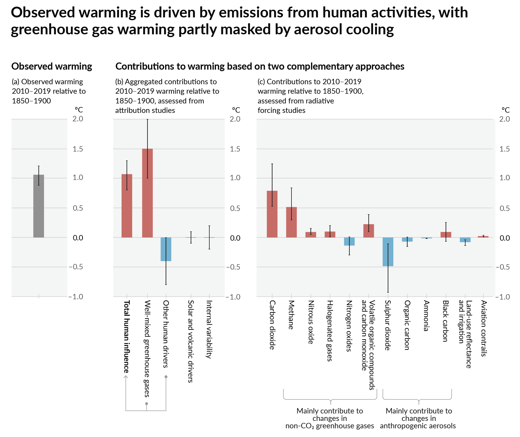
How much each change to the atmosphere has warmed the world:

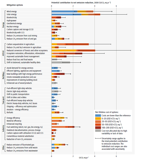
Recommended actions to cut greenhouse gas emissions in the near future:

Anti-science, inactivism, and unsupported conspiracy theories are not ok here.
founded 2 years ago
MODERATORS
you are viewing a single comment's thread
view the rest of the comments
view the rest of the comments

If you're reading this than you're probably included in that 10%
Yeah, this is true.
From the actual report:
https://www.visualcapitalist.com/visualizing-top-countries-by-wealth-per-person/
Adding up the top 10 countries' populations doesn't even reach 630 million.
People will probably use this to say that the top 10% need to pay for taxes and be held accountable, without realizing they're probably in that 10%.
I'd actually like to see the 10% broken down even further.
According to the last wealth calculator I tried I'm in the 30%
Wait until the rest of the population catches up. That graph will look like a full height chonker.
which 10%? there are two on the chart