this post was submitted on 15 Jan 2025
752 points (91.0% liked)
Fediverse
35854 readers
74 users here now
A community to talk about the Fediverse and all it's related services using ActivityPub (Mastodon, Lemmy, KBin, etc).
If you wanted to get help with moderating your own community then head over to !moderators@lemmy.world!
Rules
- Posts must be on topic.
- Be respectful of others.
- Cite the sources used for graphs and other statistics.
- Follow the general Lemmy.world rules.
Learn more at these websites: Join The Fediverse Wiki, Fediverse.info, Wikipedia Page, The Federation Info (Stats), FediDB (Stats), Sub Rehab (Reddit Migration)
founded 2 years ago
MODERATORS
you are viewing a single comment's thread
view the rest of the comments
view the rest of the comments

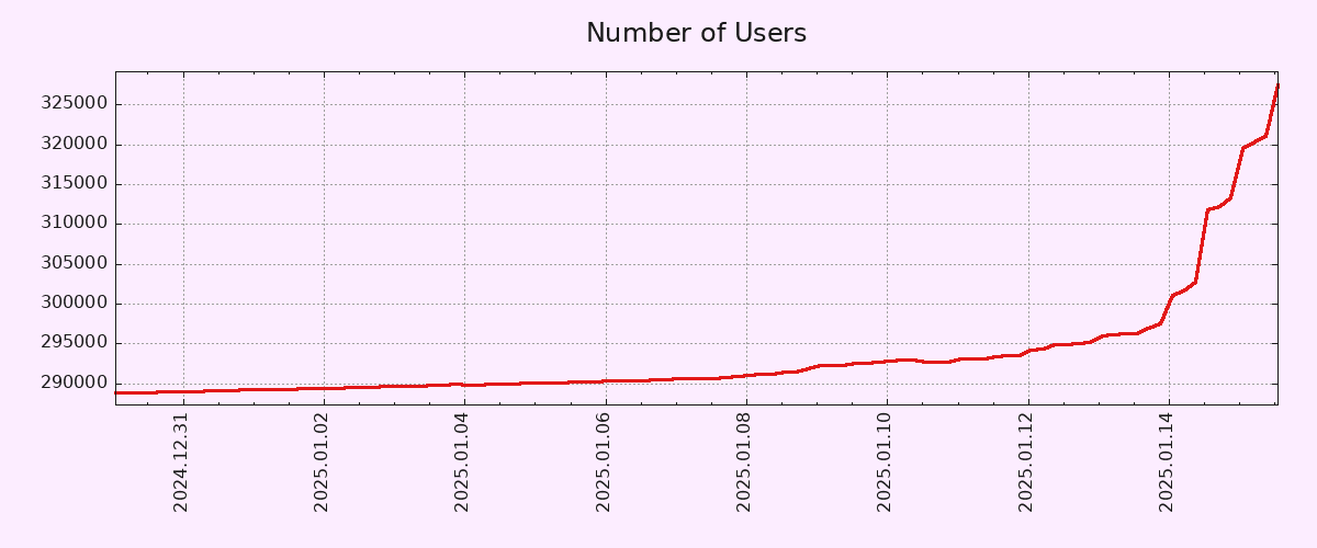
To be fair, the Y-Axis doesn't start from zero.
That being said, 10% account growth in 2 days is pretty solid. Let's hope both account creation and engagement metrics (MAUs/DAUs) keep growing.
EDIT: Correct Axis type.
Pedantic: You mean Y-axis, right? Technically, neither start at zero but I think you meant Y based on context.
No, all time based graphs should start at the big bang.
I actually wish this were true. Sure, they would show the snippet for the time we care about, but they MUST provide the source graph that contains all data back to the Big Bang. Specifically the Plank Era, we don’t want a graph where time doesn’t exist, that would make the graph useless.
Sign me up for your newsletter
I'm still waiting for someone to do an x-up coordinate system just to mess with people.
Yes, of course the Y axis.
I work with charts/vizualizations/data a lot, but for whatever reason I reflexively mistake X/Y a lot. It's not even funny.
I make the same mistake all the time for some reason, though I know which is which. I have a theory the reason is that the X axis is often used to plot years (Y), which messes with my brain ever so slightly.
That said, I don't think the Y axis should necessarily start in zero in a graph that seeks to show the pattern of growth rather than the number of users in absolute terms. If anything, a longer X axis would have been more useful, in order to show how unusual such a growth pattern is.
Y has a vertical part, just like its axis. X is the other one.
This is like a weird personal thing that I can't even explain. For whatever reason, the Y axis becomes labelled as X in my mind in random situations. And I use charts (and other data visualizations a lot).
The funny thing is when I am thinking of X, I don't have this urge to call it Y. If I am looking at horizontal, X is the first thing that comes to mind. But not with Y.
Isn't that a 1‰ growth or am I mathing wrong?
Edit: I'm wrong and that's why I shouldn't comment first thing in the morning. The math is mathing, I'm just not braining.
You are mathing wrong. The GP is correct, except for the fact that it applies to the Y axis.
(... it's a much smaller change on the X axis anyway, something with 10 zeros before the first non-zero digit...)
Its ~12%
One percent of 300,000 would be 3,000.
Starting the y-axis zero wouldn't change the shape of the curve at all, but it would make the increase seem less dramatic.
It's a ~10% increase, but the scale makes it look like the count shot up by 10x at first glance. I know that's why you always need to look at the axis labels, but graphs like this are purposely presented this way because they're easy to misinterpret for the average person.
It was an error on my part.