this post was submitted on 22 Dec 2024
71 points (85.1% liked)
Map Enthusiasts
3599 readers
278 users here now
For the map enthused!
Rules:
-
post relevant content: interesting, informative, and/or pretty maps
-
be nice
founded 2 years ago
MODERATORS
you are viewing a single comment's thread
view the rest of the comments
view the rest of the comments

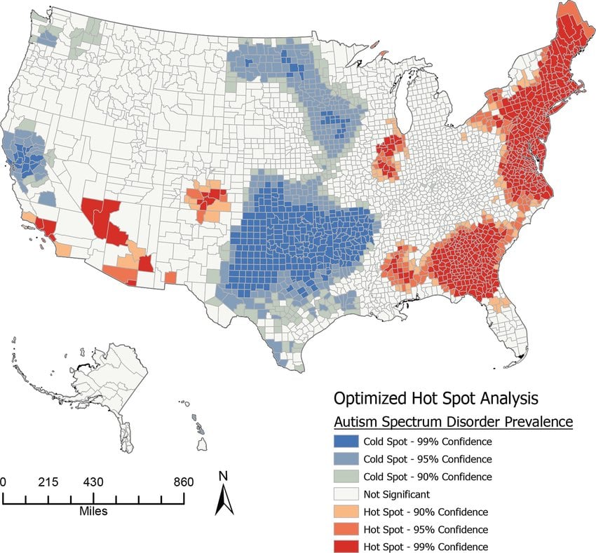
One can interpret the maps as: Rural children are diagnosed less than children in large cities
Map can be interpreted as "if you look for something, you'll find it."
Absolutely not. There's some hugely populated places in cold spots here and very rural hot spots. Rural Georgia is all red here. The greater San Francisco bay area is a cold spot. Dallas-Ft. Worth, Minneapolis, Seattle too. Some very rural parts of Mississippi are hot spots here.
I don't know, a lot of the red is over pretty rural areas in the south and parts of the southwest, and the majority of the most rural parts of the country are "not significant".
Also that big blue part in the middle covers some very large cities.
The 'not significant' part could be due to low numbers in general, so they can't get the variances small enough to get low p numbers. It's a quote that I can't quite remember perfectly that is well known in sociology/psychology: "The only reason our findings aren't significant is because we're too damn lazy to drag enough people in for the study."
All kinds of medical regulation, financing etc. could lead to differences like this.
Could also be effects of air pollution or something. There’s not enough information to tell.
But yeah, maps like this are almost always cities doing things differently than rural areas.
Could represent genetic distribution. Autism is heritable.
The middle of nowhere Montana has more pollution than downtown Dallas?
Well the point was more “unknown environmental effects” rather than air pollution specifically.
Isn’t the oil industry doing stuff up in Montana?
Yeah. Could also be that spending time outside also helps. (The causation might be reversed though).