this post was submitted on 29 Jun 2024
-96 points (24.7% liked)
Linux
48323 readers
655 users here now
From Wikipedia, the free encyclopedia
Linux is a family of open source Unix-like operating systems based on the Linux kernel, an operating system kernel first released on September 17, 1991 by Linus Torvalds. Linux is typically packaged in a Linux distribution (or distro for short).
Distributions include the Linux kernel and supporting system software and libraries, many of which are provided by the GNU Project. Many Linux distributions use the word "Linux" in their name, but the Free Software Foundation uses the name GNU/Linux to emphasize the importance of GNU software, causing some controversy.
Rules
- Posts must be relevant to operating systems running the Linux kernel. GNU/Linux or otherwise.
- No misinformation
- No NSFW content
- No hate speech, bigotry, etc
Related Communities
Community icon by Alpár-Etele Méder, licensed under CC BY 3.0
founded 5 years ago
MODERATORS
you are viewing a single comment's thread
view the rest of the comments
view the rest of the comments


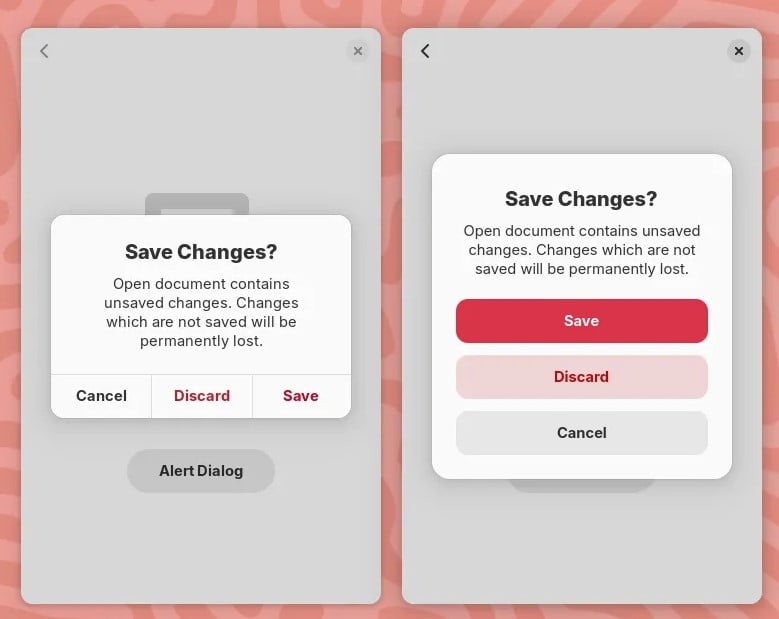
And gnome has those dialogs in a different colour to achieve easily noticable differentiation between the two options
The issue there isn't only differentiation, that well done, the issue is that an user might miss click because both buttons are close to each other.
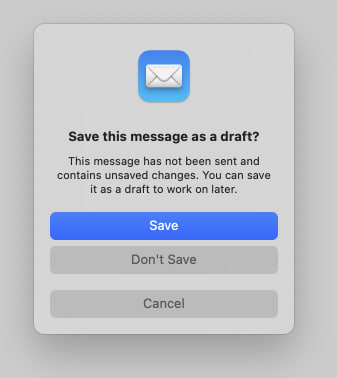
That same logic could be applied for the save and discard button. Should there be a bigger gap between them lest somebody misclick and discard things instead of saving them¿? Atleast in the case where they accidentally click cancel instead of discard, they are not losing any data.
Hell if this really about data safety, discard/don't save should be the isolated button because it is the only destructive option
According to the UX experts you don't need the space between the save and discard buttons as long as the "save" is the first one. Missclick are more prone to happen from top to bottom than the other way around, so if the user wanted to hit "save" it's more likely he will click above the button than it is to click "discard". Same logic applied down there, when the using is looking to cancel it's easier to missclick and hit the "discard" button than anything else.
Can you share any study for this. If this is true, it is fascinating and worth looking into in more depth
This is an application of Fitts's law. I saw some paper referencing it to back that kind of margins on destructive actions but I don't remember the title.
Well fitts law doesnt mention anything about asymmetrical spacing anywhere. Infact going by fitts law, the new gnome design is great because the hitboxes are pretty large
That's what the paper was about, the law also applies the in reverse, adding the space protects the user because it makes it harder to click on the hitbox.