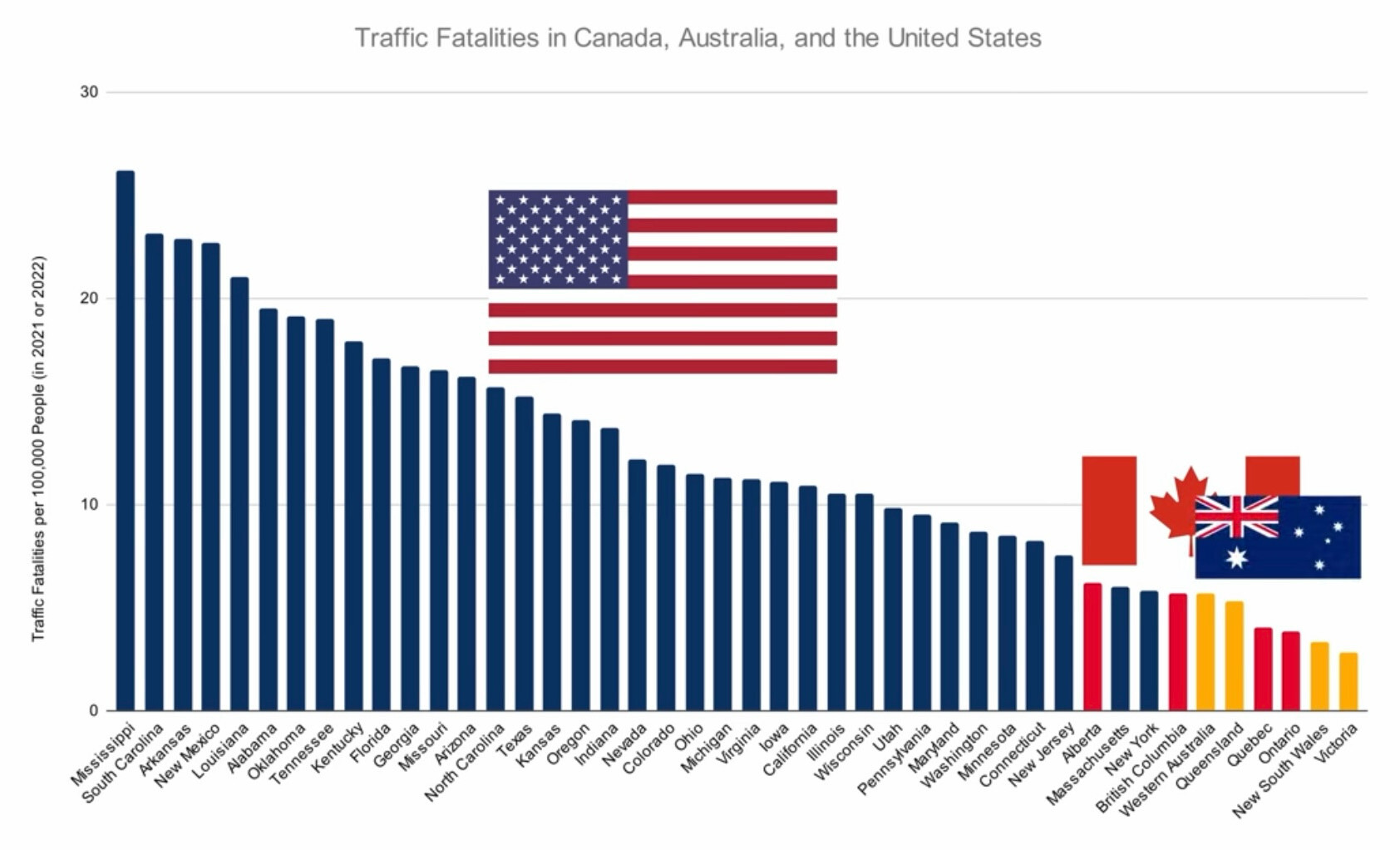
this post was submitted on 03 Jul 2025
427 points (97.6% liked)

Mildly Interesting

21725 readers
665 users here now

This is for strictly mildly interesting material. If it's too interesting, it doesn't belong. If it's not interesting, it doesn't belong.

This is obviously an objective criteria, so the mods are always right. Or maybe mildly right? Ahh.. what do we know?

Just post some stuff and don't spam.

founded 2 years ago
MODERATORS
(page 3) 30 comments
sorted by: hot top controversial new old
[–] HikingVet@lemmy.ca 1 points 1 week ago (6 children)
load more comments (6 replies)
[–] Gladaed@feddit.org 1 points 1 week ago

Clearly fake as it doesn't show a state that's better the non Americans. In big America, there are clearly more states!

[–] Smoogs@lemmy.world 1 points 1 week ago

Wait what?? British Columbia is less than Alberta? There are single lanes in dangerous areas in comparison to Alberta.

[–] null_dot@lemmy.dbzer0.com 1 points 1 week ago

In fairness Australia has a low population density, and is not so mountainous, and we have very little snow et cetera.

That said I guess we do have hazards like kangaroos, and a larger road network to maintain (per capita).

Also depending on. When these stats are from they might pre-date the influx of shitty over-sized little-mans American cars. Thats sure to increase the rates of fatalities.

[–] jpreston2005@lemmy.world 0 points 1 week ago (4 children)

The fact that California, a state with THIRTEEN TIMES MORE PEOPLE than Mississippi, has less than half the number of traffic fatalities is mind blowing. Mississippi is just 30% of the landmass that California represents, and yet it gets more than double the amount of traffic fatalities.

Looking at the left side of the graph, the trend is easily recognizable. Drunk angry and repressed, poverty stricken republicans will drive drunk like it's the right to bear arms. The further right you go, the more democratic the state.

load more comments (4 replies)
[–] simplejack@lemmy.world -1 points 1 week ago* (last edited 1 week ago)

How you know this is good data

  1. No sources. Just a chart.
  2. Randomly compares some places in North American to some places in Australia.
load more comments
view more: ‹ prev next ›