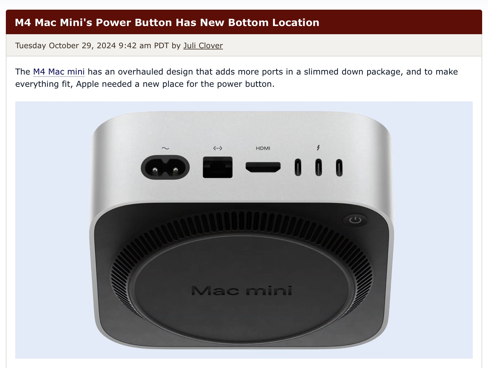
They wanted to put it inside the unit originally
Technology
This is a most excellent place for technology news and articles.
Our Rules
- Follow the lemmy.world rules.
- Only tech related news or articles.
- Be excellent to each other!
- Mod approved content bots can post up to 10 articles per day.
- Threads asking for personal tech support may be deleted.
- Politics threads may be removed.
- No memes allowed as posts, OK to post as comments.
- Only approved bots from the list below, this includes using AI responses and summaries. To ask if your bot can be added please contact a mod.
- Check for duplicates before posting, duplicates may be removed
- Accounts 7 days and younger will have their posts automatically removed.
Approved Bots
Now you can slam the top of the machine to boot it up
Well at least now you can actually see the damn black ports on the silver chassis. The M2 Mac Mini has the black ports on the black backside and it's such a pain in the ass trying to find the USB C ports when I have to connect something.
But yeah, putting the power button on the bottom is peak Apple stupidity.
They clearly want you to let this one running 24/7, or, can you turn it on using the keyboard and that low power BT thing?
Assuming you mount it on the back of something that would probably be a pretty good place.
I use a lot of mini Linux computers and mount them to the back of monitors. I could see this design being perfect for that except it's way more expensive lol
It looks like you can push the button without lifting the tiny computer.
I also at first thought it's not that bad, because it looks like the main part of the computer is "hovering", because it stands on that round portion. But then I saw that the button is on the backside! Why? That way you have to reach around everything, making it impossible to fit the thing into some smaller space and still use it. If it was on the bottom but in the front you would still have your beloved button-less design but the button would still be pretty accessible.
To be fair, aren't those mini PCs meant for HTPCs/home servers? You're not really supposed to turn them off, and if you really want easy power button access you can just set it upside down. I'd say it's a good idea if you take into account that it's aimed at Apple customers who care more about "design" over usability. They truly "think different" over there.
Honestly as infrequently as I turn my machines off this really doesn’t bother me. The mouse on the other hand….
At least they didn't put the fucking power port on the bottom.
