What does this mean?
Be respectful
What does this mean?
Yeah, in what scale is polarisation measured? How are identity or idea-based polarisation defined? Also, what's up with the awful kerning?
This should be a scatter plot.
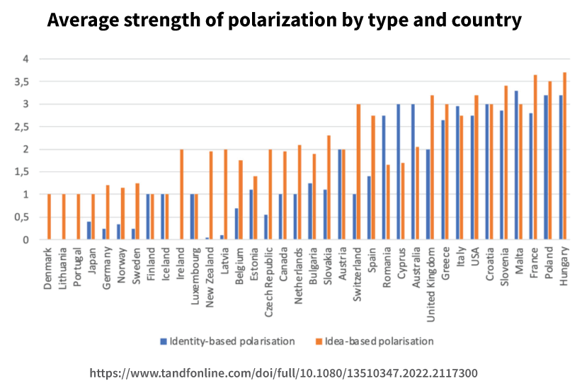
Link https://www.tandfonline.com/doi/full/10.1080/13510347.2022.2117300#abstract
Definition of concepts from abstract:
Political views, opinions, and worldviews become increasingly irreconcilable (idea-based polarization), while at the same time society appears to be getting fractured in antagonistic, opposing camps (identity-based polarization).
I'm not sure how it is actually measured. It is from the v-dem dataset. Is that questionaire data?
Thanks for the link
God if only there were a way to plot x by y on two independent axis...
axes
could we install a turbine and use this to generate power
If populist propaganda could generate power we'd be fossil fuel free by next week
I see USA, Hungary, and Poland up there pretty high. I wonder if Russia has anything to do with that.
Definitely
How does one read this chart?
Just go to the link, which is a long string of numbers displayed as text in an image so as to be as cumbersome as possible.
by downloading the data and turning it into a scatter plot
I'm curious the method here. The USA I would guess at being 90%+ firmly one or the other with a handful of squishy between, but how do they measure the level of it... 🤔