this post was submitted on 15 Nov 2025
233 points (96.8% liked)
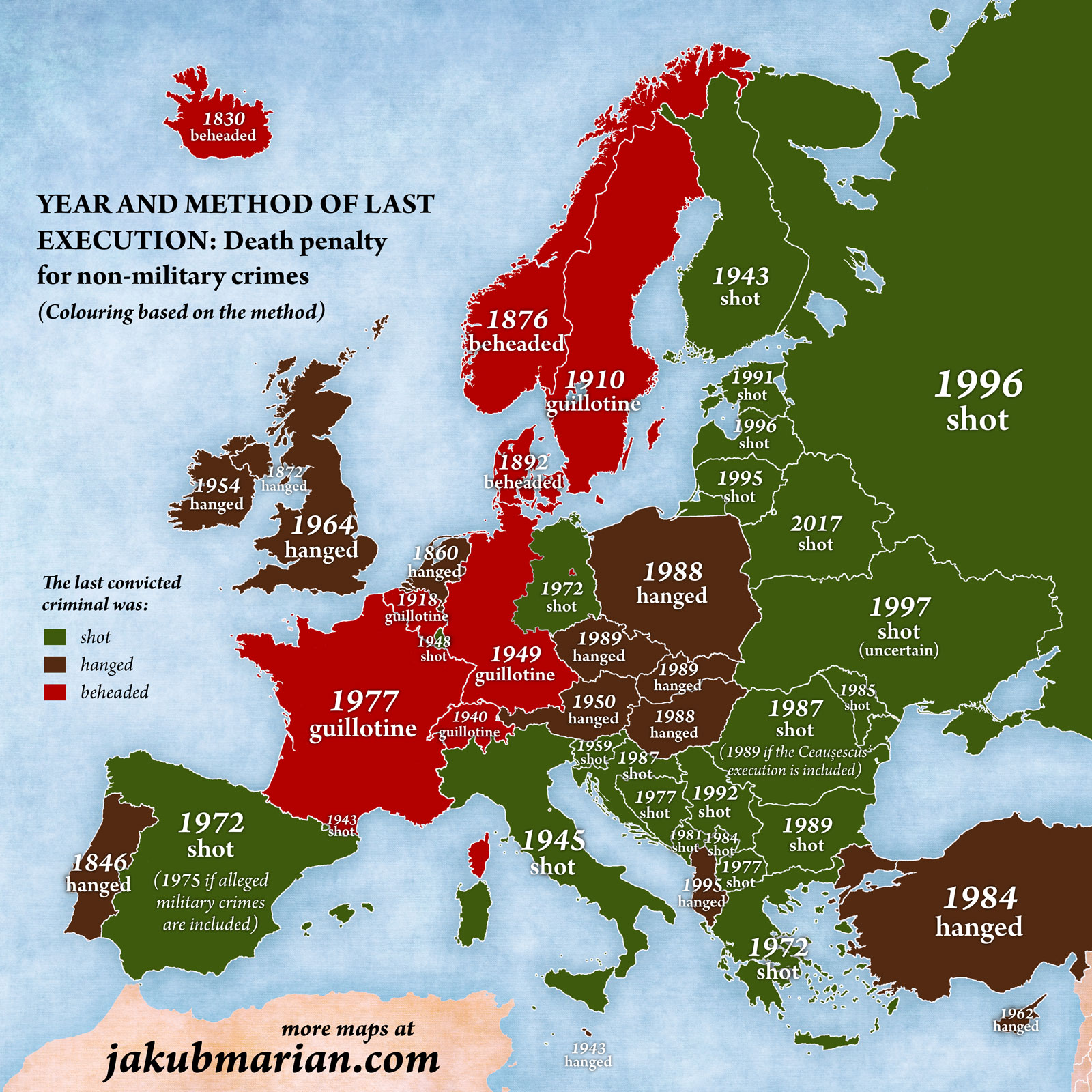
Map Enthusiasts
5303 readers
75 users here now
For the map enthused!
Rules:
-
post relevant content: interesting, informative, and/or pretty maps
-
be nice
founded 2 years ago
MODERATORS
you are viewing a single comment's thread
view the rest of the comments
view the rest of the comments
Due to the methods and years being roughly correlated the colour scheme makes it look like the map is saying that more recent is better