Comments
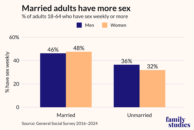
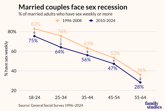
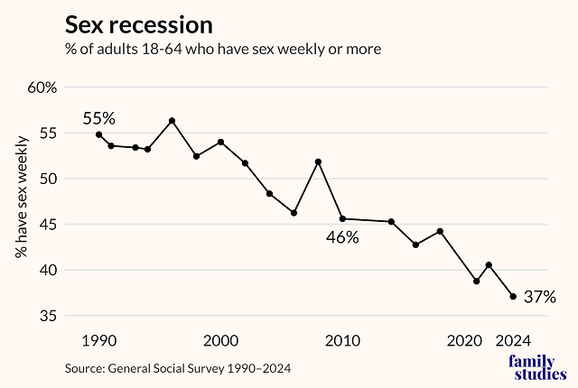
- Married adults have markedly more sex than their unmarried peers, but the sex recession is also making inroads among married couples.
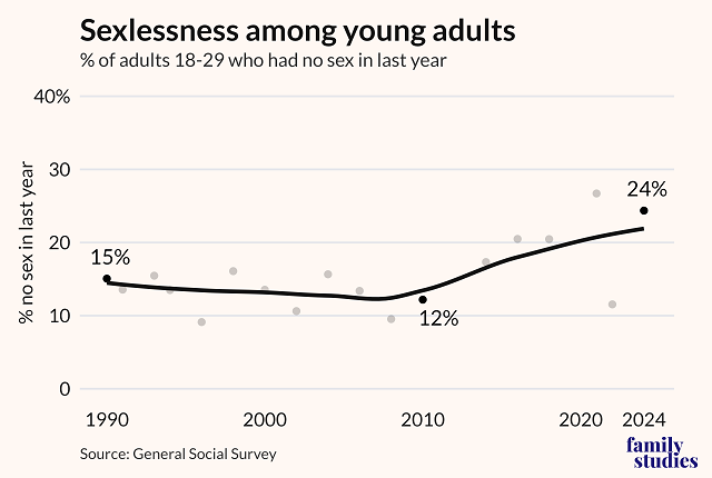
- When it comes to sexlessness (“no sex in the last year”) among young adults, the biggest change comes post-2010.
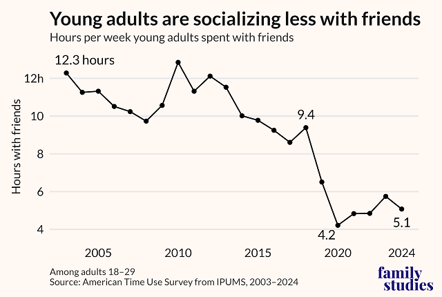
- Between 2010 and 2019, the average time young adults spent with friends in a given week fell by nearly 50%, from 12.8 hours to just 6.5 hours.
Source: Institute for Family Studies.
That last graph makes no sense being joined like that
Also no sample sizes
It took me a moment to parse it, too. It's trying to show the decrease in each age group between the earlier range of years and the more recent one. I'm guessing they're lumping all those years together into a single value to minimize the effects of any short-term trends.