this post was submitted on 27 Feb 2025
384 points (97.8% liked)
Data Is Beautiful
7991 readers
1 users here now
A place to share and discuss data visualizations. #dataviz
founded 4 years ago
MODERATORS
you are viewing a single comment's thread
view the rest of the comments
view the rest of the comments
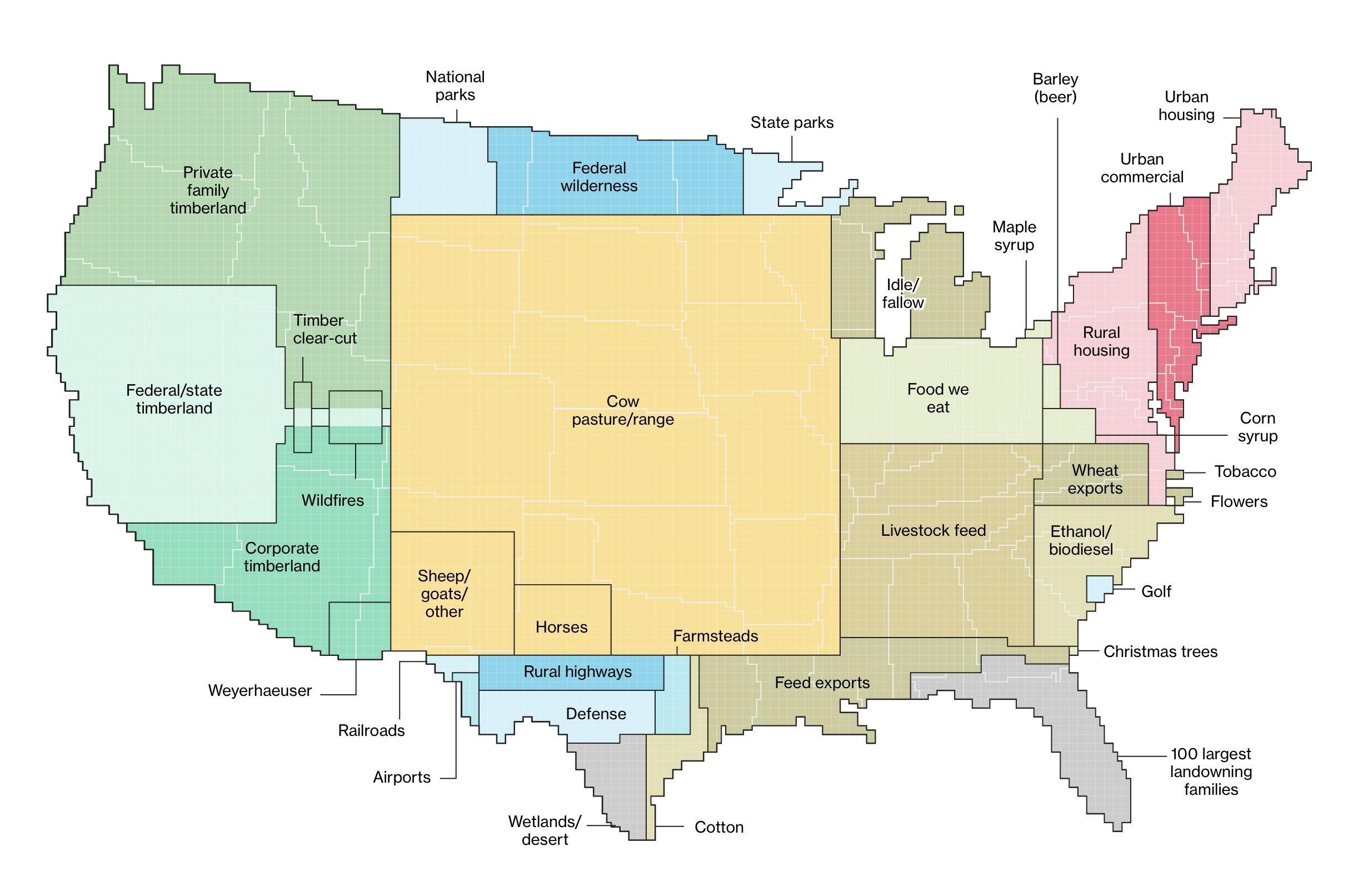
I think the graphic would be better if some of the data were nested by size and relationship. IOW Agricultural land would have grazing, food production, feed production, etc. in decreasing size nested over an area. Might give greater sense of how much land is used for ag. Same for forestry; Forestry, parks, commercial logging, etc.