this post was submitted on 20 Jun 2024
444 points (98.1% liked)
Programmer Humor
19331 readers
20 users here now
Welcome to Programmer Humor!
This is a place where you can post jokes, memes, humor, etc. related to programming!
For sharing awful code theres also Programming Horror.
Rules
- Keep content in english
- No advertisements
- Posts must be related to programming or programmer topics
founded 1 year ago
MODERATORS
you are viewing a single comment's thread
view the rest of the comments
view the rest of the comments
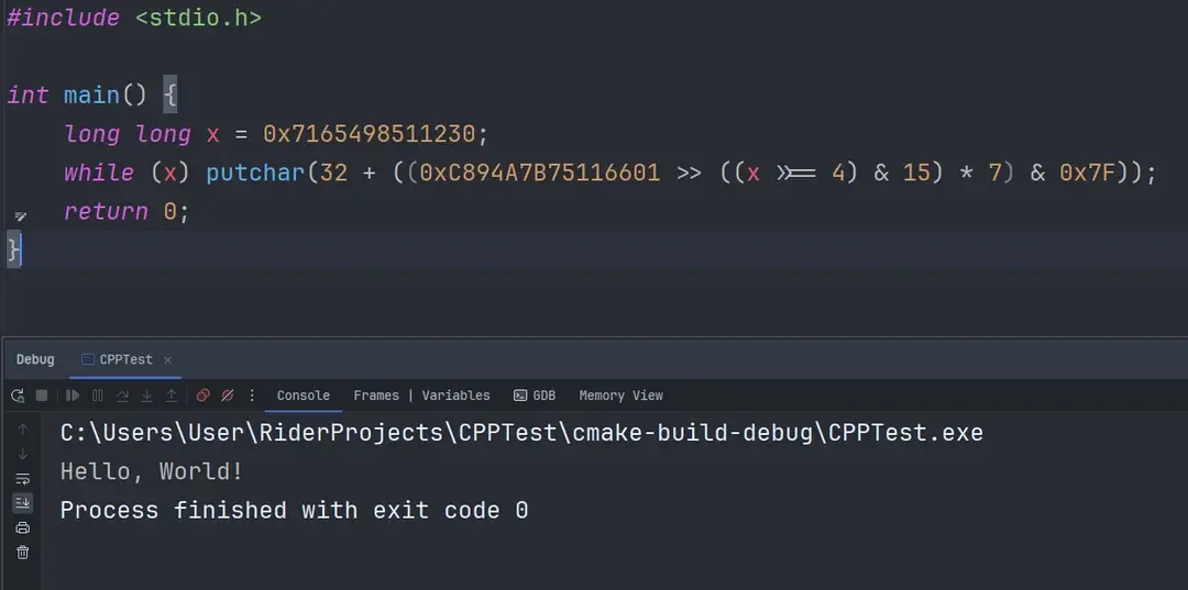
LGTM. Though do people really code with ligatures turned on?
Edit: Ok so there are some big advocates of ligatures, I’m going to have to give them a second chance. I’ll try for a week, and either way that Fira Code font looks great.
I was skeptical of ligatures at first, too, it took me awhile to warm up to it. But yeah, love me some Fira Code now.
That’s neat, so TIL ligature in code do actually have a strong following
I always do, I love having ligatures
Having ≠ looks much nicer then !=
Ah! You see, in my mind != looks nicer than ≠. Haha
That's why those exist
Yes, I use Fira Code myself
When you realize 90% of programming is reading, then you'll end up embarking on a journey to make code more readable. At some point you fall in love with ligatures.
Ligatures make code way easier to read, especially if you’re using lambdas or a language with different comparison operators than “normal”.
Yes, with Iosevka font
Long live Fixedsys! My favourite font since before time.
I found a version with ligatures. Love the thick equally spaced characters. Makes stuff so nice to read.