this post was submitted on 16 Jun 2024
266 points (92.9% liked)
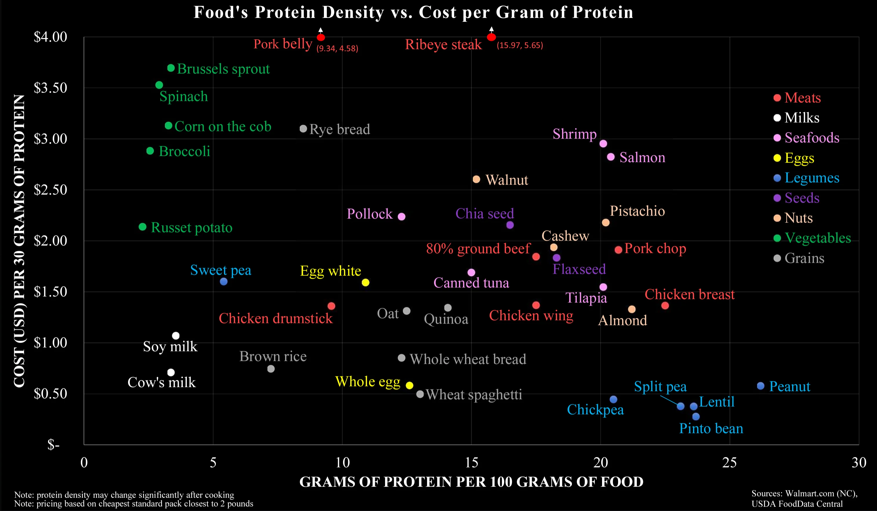
Data Is Beautiful
8663 readers
1 users here now
A place to share and discuss data visualizations. #dataviz
founded 4 years ago
MODERATORS
you are viewing a single comment's thread
view the rest of the comments
view the rest of the comments
It's not that they are separated on the chart, but that they are comparable (on both axes), that impressed me.