this post was submitted on 27 Mar 2024
333 points (96.1% liked)
Open Source
42206 readers
544 users here now
All about open source! Feel free to ask questions, and share news, and interesting stuff!
Useful Links
- Open Source Initiative
- Free Software Foundation
- Electronic Frontier Foundation
- Software Freedom Conservancy
- It's FOSS
- Android FOSS Apps Megathread
Rules
- Posts must be relevant to the open source ideology
- No NSFW content
- No hate speech, bigotry, etc
Related Communities
- !libre_culture@lemmy.ml
- !libre_software@lemmy.ml
- !libre_hardware@lemmy.ml
- !linux@lemmy.ml
- !technology@lemmy.ml
Community icon from opensource.org, but we are not affiliated with them.
founded 6 years ago
MODERATORS
you are viewing a single comment's thread
view the rest of the comments
view the rest of the comments

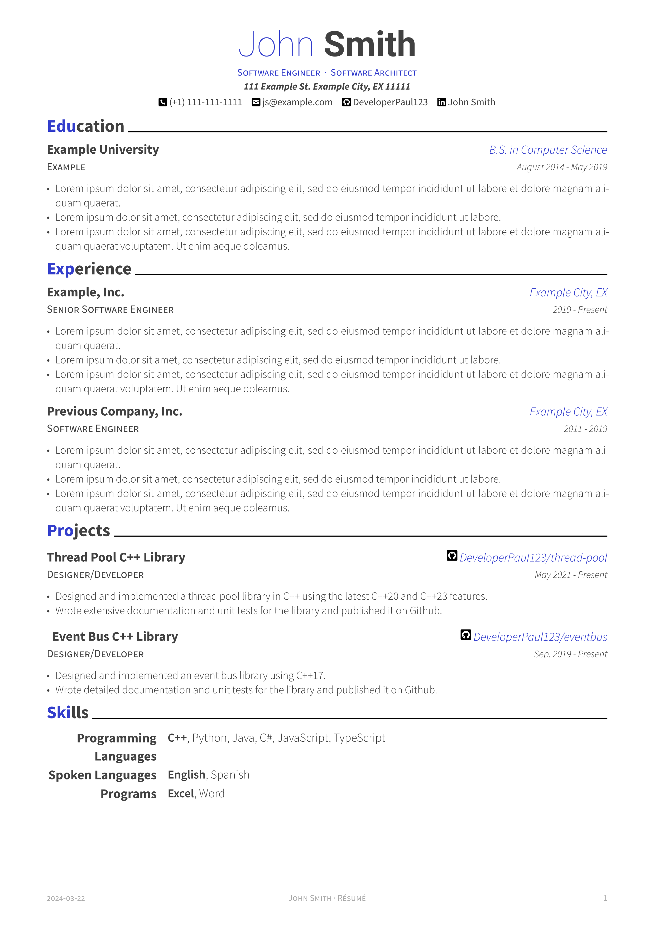
Please don't color part of a word blue and part of a word black
The world must know of my skills.
Do you mean your 1337 2k1llz?
Exactly where my eyes went. Pro, Exp, ... Ski?
Professional Experience
Education
Networking information
Inerests
Skills
This is interesting as I simply copied the same styling as the previous template I was using. Would it be better to highlight the entire first word instead of the first n letters?
All of those headings are single words.
Taste is subjective, but mine says either color the whole heading or don't color it at all.
Black only. Either bold or italics if you feel the need to add emphasis.
Most resumes are parsed by tools and you'll never see fancy formatting anyways.
This type of resume isn't for the tools, it's for the humans who glance at the resume before the interview.
I've used the template this is based on before. I just set the default color to black and modified the word to be all bold.
I appreciate that OP did a perfect port though.