this post was submitted on 20 Feb 2024
1249 points (98.4% liked)
Programmer Humor
24980 readers
1767 users here now
Welcome to Programmer Humor!
This is a place where you can post jokes, memes, humor, etc. related to programming!
For sharing awful code theres also Programming Horror.
Rules
- Keep content in english
- No advertisements
- Posts must be related to programming or programmer topics
founded 2 years ago
MODERATORS
you are viewing a single comment's thread
view the rest of the comments
view the rest of the comments

Can someone explain to me why github apparently has bad UX/UI? I always thought the UI has gotten really good over the years.
[Edit] Like there this huge argument in these comments about the release button being all wrong. ??? No clue what people have against it. I thought it was fine? You can use it or not. People link to it if they want it more prominent. Someone explain?
[Edit 2] Also what's up with the people who are vehemently against uploading bins to GitHub releases. This is literally what github is doing on their own repos. Not trying to say that anyone should feel obligated to release bins (CI/CD is a literal job title). People are releasing software for free because they want to. Let's not look a gift horse in the mouth.
Idk I'm gonna stop reading this thread. its driving me crazy.
Around last year or the year before that they changed the placement of that button, never really given much thought about it tbf. Just a minor annoyance.
But yeah it was like in the same top row as the code/issues/pull-requests/wiki pages. Now you can only access it from the code page inside a lateral panel. Before that you could just jump to the releases from the wiki page, as an example.
I find that when you know how to use Github, Github is pretty easy and close to perfect for what it is, a code repository.
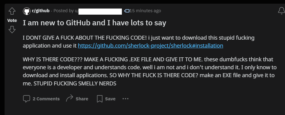
I think that most people who stumble across a Github link through a Google search, probably like in the original post, want to treat it like an app store. The read.me is the description, so they can tell it kind of does what they need, but they're missing a big, green download and install button.
FTFY