this post was submitted on 20 Feb 2024
1251 points (98.4% liked)
Programmer Humor
27113 readers
1488 users here now
Welcome to Programmer Humor!
This is a place where you can post jokes, memes, humor, etc. related to programming!
For sharing awful code theres also Programming Horror.
Rules
- Keep content in english
- No advertisements
- Posts must be related to programming or programmer topics
founded 2 years ago
MODERATORS
you are viewing a single comment's thread
view the rest of the comments
view the rest of the comments

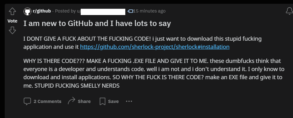
Imo they aren't even trying, because it's not that hard to make it better. Doesn't even have to be a compromise. Most people just need a visible download button for the programs, that's all.
If that's a concern for the project maintainers, they should create a homepage for the project with download links.
Or make a shortcut/link in the readme to the newest release of the most popular OS's.
A decent release page tends to contain all kinds of files for different OS, so 'regular' people who just want the .deb or .exe would likely become confused regardless.
Imagine how many download buttons would be if Github had ads.
SourceForge had a better UX for those who just want to download software.
And SF is horrible, so this says a lot.
There is, it's literally right there on the home page of the project. You can either copy a URL and download it by cloning the git repo, or you can download the whole project as a zip file. Then you just have to compile it!
GitHub is for developers, not end users.
It's not a compromise to make another download button for the last release as well. No one looses.
That's not a download button for the program. But there is indeed a link to the release page right on the home page of the project, so you're still correct.