this post was submitted on 16 Jan 2024
188 points (78.1% liked)
Programmer Humor
38151 readers
38 users here now
Post funny things about programming here! (Or just rant about your favourite programming language.)
Rules:
- Posts must be relevant to programming, programmers, or computer science.
- No NSFW content.
- Jokes must be in good taste. No hate speech, bigotry, etc.
founded 6 years ago
MODERATORS
you are viewing a single comment's thread
view the rest of the comments
view the rest of the comments

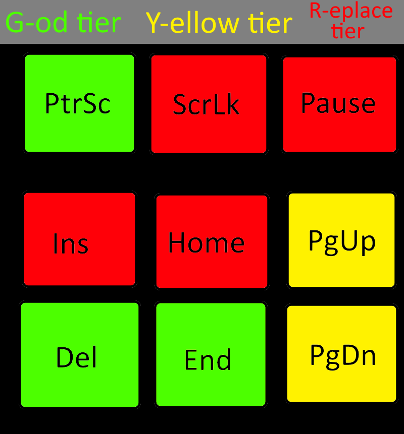
Most tier lists use a tabular format, often horizontal. This one looks like a table organized vertically. Except it's neither and instead uses color, but isn't R/G colorblindness the most common form? Anyway, I'm saying that I found it confusing.
Then again, you posted infinitely more to Lemmy today than I did (at zero:-P), so there is no need at all to listen to my whining if you aren't interested in such feedback on presentation style:-D.
I'm severely deutan, even then red and green are a clear difference. Yellow is a bit harder to see, but still visible. Should not be an issue unless you are suffering from dichromatism.
I’m fully protan and cannot tell the difference between the god-tier and yellow tier colors at all. They are literally the same to me.
Really? I didn't know that.
When I did the color shading test I failed crazy with the shades between green and red, including yellow. Obviously I failed the whole board, but that was the worst though.
Can you try to see the difference, because you should see it, with colorblindness the shades are just harder to see? If you actually cannot tell the difference you might have something else than protanomaly, like missing one cone completely rather than a shifted one.
Unless you meant protanopia, rather then protanomaly, the -nopia means a missing cone aka dichromacy, and -nomaly a shifted one I think?