this post was submitted on 13 Jan 2024
480 points (92.0% liked)
memes
10417 readers
2592 users here now
Community rules
1. Be civil
No trolling, bigotry or other insulting / annoying behaviour
2. No politics
This is non-politics community. For political memes please go to !politicalmemes@lemmy.world
3. No recent reposts
Check for reposts when posting a meme, you can only repost after 1 month
4. No bots
No bots without the express approval of the mods or the admins
5. No Spam/Ads
No advertisements or spam. This is an instance rule and the only way to live.
Sister communities
- !tenforward@lemmy.world : Star Trek memes, chat and shitposts
- !lemmyshitpost@lemmy.world : Lemmy Shitposts, anything and everything goes.
- !linuxmemes@lemmy.world : Linux themed memes
- !comicstrips@lemmy.world : for those who love comic stories.
founded 1 year ago
MODERATORS
you are viewing a single comment's thread
view the rest of the comments
view the rest of the comments

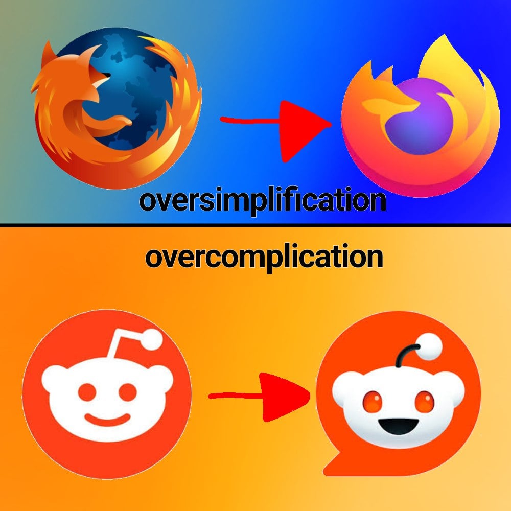
I used to not like the new Firefox logo when it first came out, but by now, I couldn't do with the old one, it looks so much... And I bet if they changed it back, it would take me 2 months max to switch opinions right back.
At some point I have to accept, I'm just an ape of habit.
Honestly, its considered a hot-take but I do like minimalistic logos cause they are easier to recognize. Also they tend to better fit with the rest of the UI and products.
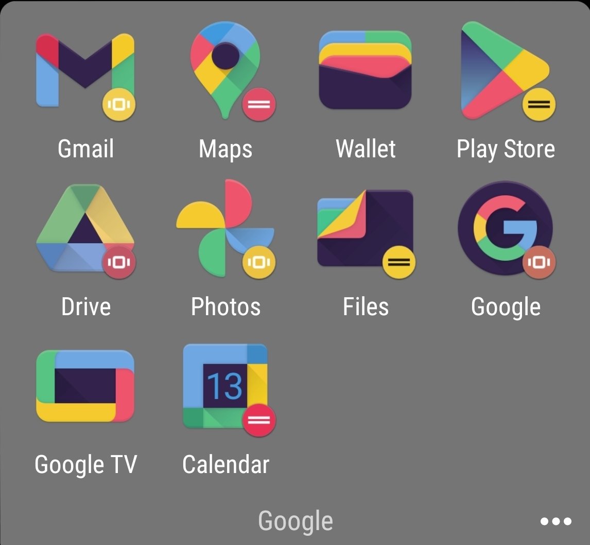
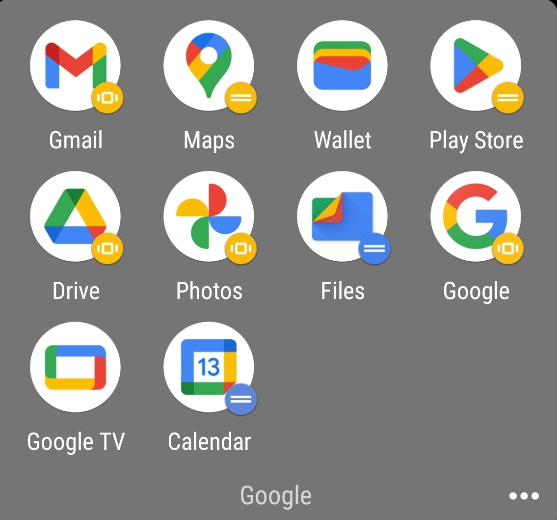
Counterpoint is the bullshit Google did with all their icons. Same exact colors with different shapes makes quick differentiation an actual challenge.
That's gotta be an icon pack, given the black and the weird colors. Am I wrong? Did they change it since I last used the stock icons?
I forgot I had an icon pack on. Original is actually worse. No large silhouettes to work with.
Not disagreeing with you there. I wasn't even much of an icon pack guy until they did the white circle thing. It looks so cheap
And then they introduced to android a new option that only showed the shape of the icon in two tones. Now they have no colour and are just odd shapes.
I can't tell you how often I've opened Google Drive when I meant to open the Gmail app or vice versa.
I know they technically don't look that much alike, but at a glance they're way too similar. Just use a different color for each app please?
Why does Drive not match the color tone of the rest of them? It’s so muted.
Those icons absolutely do not look normal, there's some kind of theme being applied to all of them, likely a dark mode before it became a standardised feature, by the looks of it.
Although the icons are kinda not minimal with the amount of colors in there, they could have like made one app with one or two colors and the other with different ones
It all depends on context. The Firefox logo is good and fine as a brand logo you can put on the product website, big enough, or the about dialog. But as an application icon I dislike it. I would prefer a simpler, more recognizable, flat-colored version.
I generally agree. However, for the MDN Web docs icon, I'm not sure I'll ever acclimate to that one, even with how often I see it. so bad. Love MDN still though