this post was submitted on 11 Jan 2024
1190 points (98.5% liked)
Memes
52966 readers
597 users here now
Rules:
- Be civil and nice.
- Try not to excessively repost, as a rule of thumb, wait at least 2 months to do it if you have to.
founded 6 years ago
MODERATORS
you are viewing a single comment's thread
view the rest of the comments
view the rest of the comments

That looks to be an Access prompt, from the MS office suite. If you've ever written a macro you know how ancient the UI looks behind the scenes with those apps, and this isn't even a main line office app since it deals with databases and they push excel to work with sets of data like that.
So yes it's a Microsoft product, but it's not really native Windows and it's not an app that makes a lot of sense to spend a lot of time developing.
Just for accuracy's sake. I'm certain there are better examples.
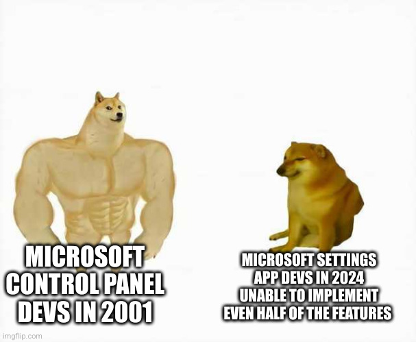
Anyways, I'm perfectly fine with dated UI as long as it's efficient and does what it's supposed to do. If they perfected this stuff way back when you had one chance to ship out a working product, is it really necessary to reinvent the wheel just for aesthetics? Cause that's how you get a neutered settings app instead of a fully functional control panel.