Data is Beautiful
1075 readers
2 users here now
Be respectful
founded 3 months ago
MODERATORS
1
2

3
5
8

9
10
12
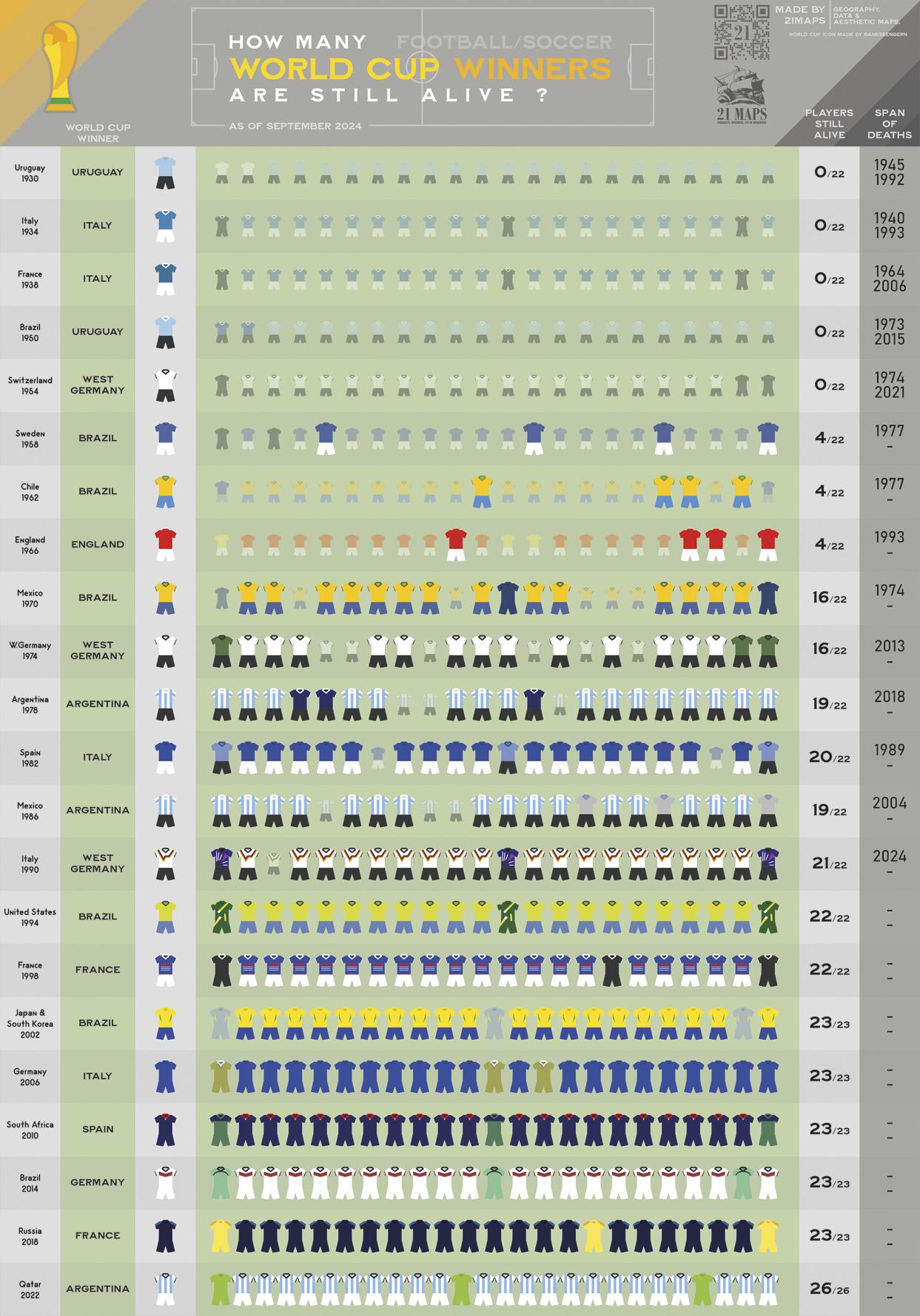
Learning about the death of the last player who played the Final of 1958, I wanted to know how many of his teammates were still alive and doing it, I learned that the first 1990 World Champion has recently died, so I decided to create this to display this information : visually show how many Football/Soccer World Champions are still alive.
Brazil 1958 is the last team with living players. Brazil 1994 is the oldest with all living players.
The first World Champion to die was Umberto Caligaris for Italy in 1940.
In a couple of months between 1973/1974 saw the first players of Uruguay's 1950, West Germany's 1954 and Brazil's 1970 teams to pass away.
There are no longer any Uruguayan World Champions that are alive. It's the only country in this case.
13
14
15
cross-posted from: https://sh.itjust.works/post/25337532
Best of luck to Mozilla. Their line on the chart may end soon if they lose funding from Google.
16
18
19
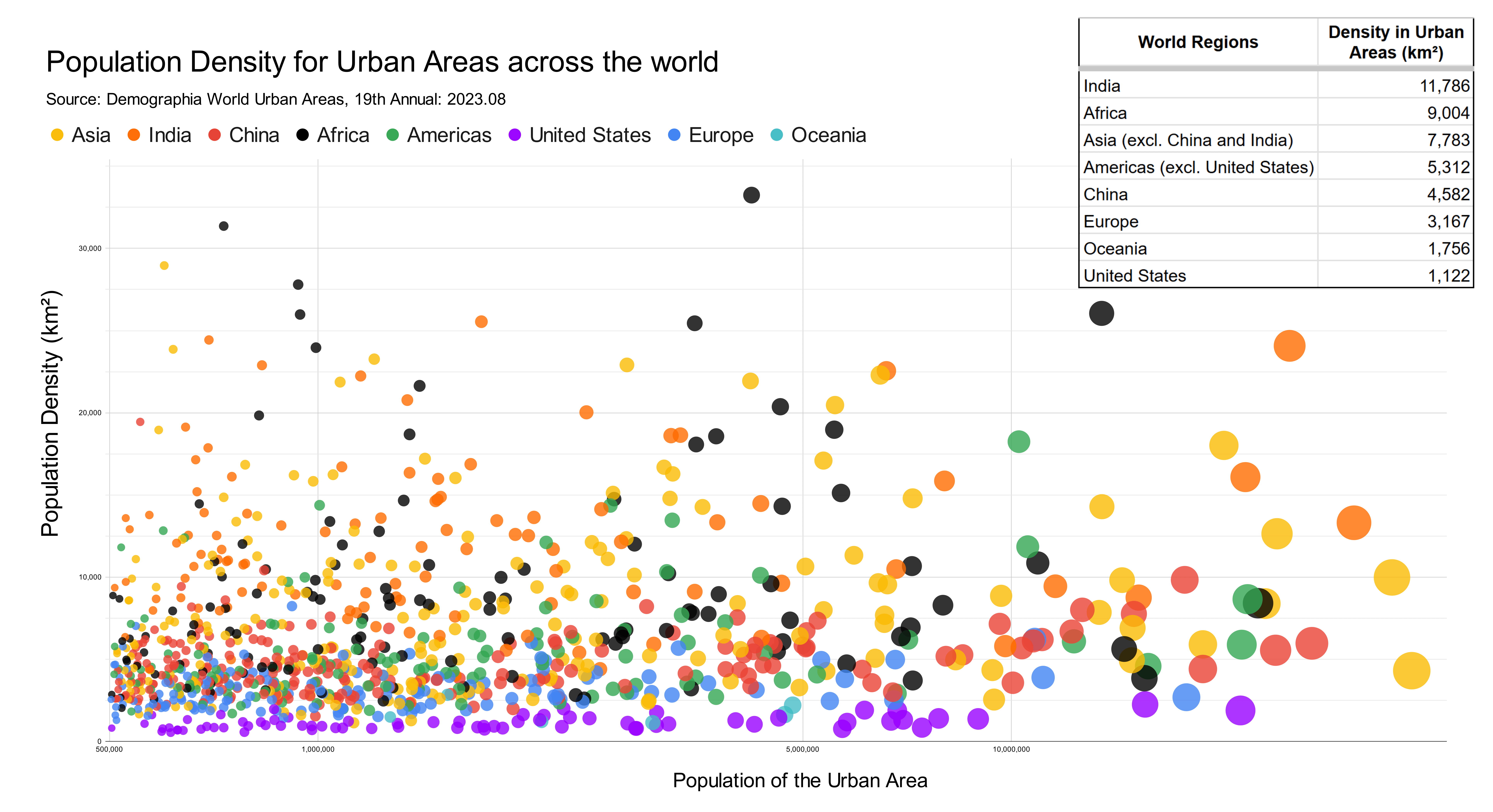
My chart shows population density in all urban areas that have over half a million people. "Urban area" basically means the built up area in and around a city, including its suburbs. The chart would be way too busy if it included labels for each city, so instead I opted to group them by the part of the world they are located in. This shows the striking difference in urban density across different parts of the world.
My data source for both population and population density came from Demographia World Urban Areas, 19th Annual: 2023.08_. This is a regularly updated collection of statistics for urban areas that include population and land area. I made this chart using Google Sheets and edited it with Inkscape.
If you're interested in diving deeper into this data, I put together a spreadsheet of the data and a detailed version of the map with city labels (which is still very cluttered). Enjoy!
20
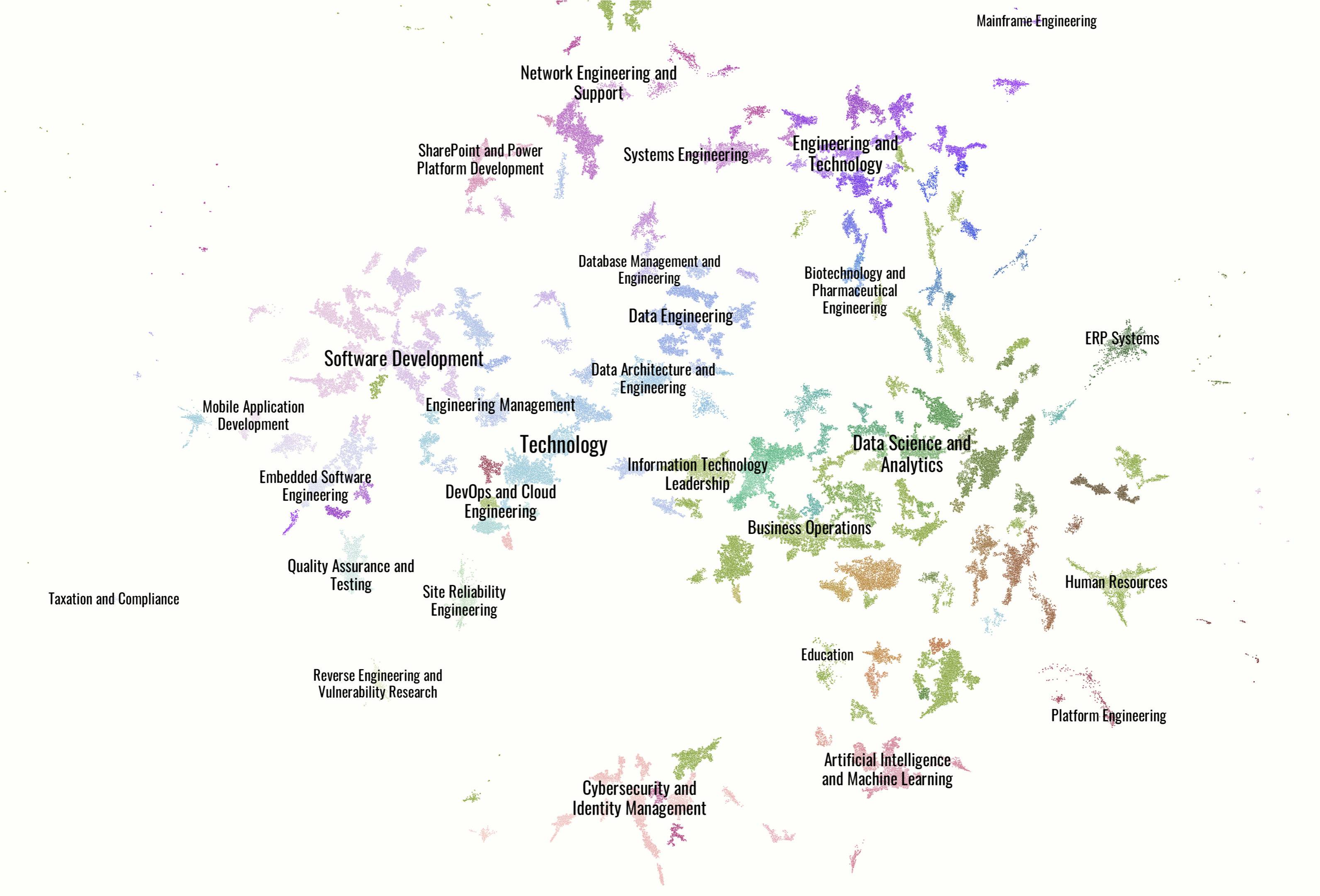
Collected US 2024 tech job postings from Indeed and embedded them with Open AI text embedding large. Reduced dimensionality and clustered via UMAP and HDBSCAN. Topic modeled with Open AI chat API. Visualized with DataMapPlot. Github pages https://hazondata.github.io/ has full interactive map. I also have real-time insights into tech job postings on my site hazon.fyi
22
1
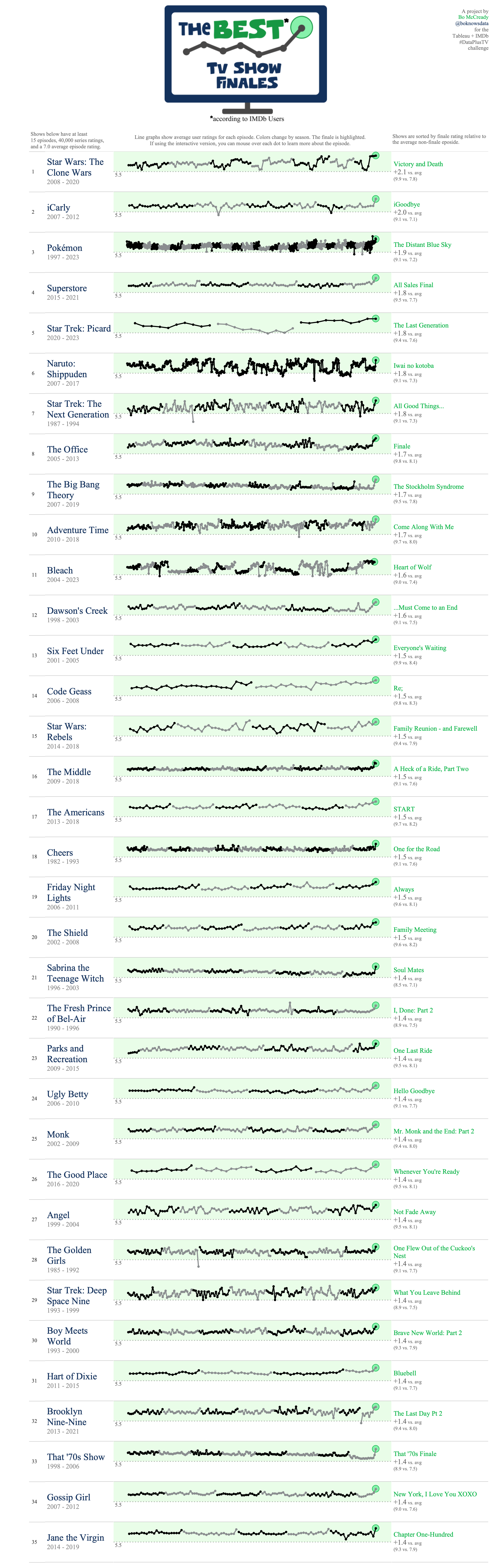
The Best TV Shows finales (Biggest positive difference between average season ratings and finale)
(files.catbox.moe)
Interactive version: https://public.tableau.com/app/profile/bo.mccready8742/viz/TheBestTVShowFinalesDataPlusTV/BestTVShowFinales
Source: https://reddit.com/comments/1f42jj3
Feel free to have a look at !showsandmovies@lemm.ee for a shows oriented community

24
0
Which European Countries Dominate Global Exports in Specific Products? A Visual Breakdown of World Export Leaders
(files.catbox.moe)
25
view more: next ›