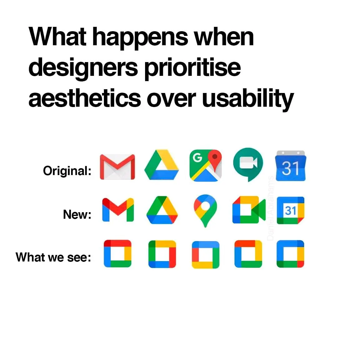
I was yelling about how windows 11 swapped out text listingzs for copy, paste, etc from its contextual menus for stupid icons just the other day. Modern UIs are becoming so “streamlined” to the point of uselessness.
Memes
Rules:
- Be civil and nice.
- Try not to excessively repost, as a rule of thumb, wait at least 2 months to do it if you have to.
The absolute worst is the idiotic "let's make all app icons the same shape" thing.
I don't love the difficulty of extremely fast individual identification but there is something to be said for the ease of extremely fast collective identification, it makes it very easy to see which group of apps each app belongs to, which is also valuable.
Except this is not "browsers" group or "email clients" group, this is "vertical monopoly" group.
Custom icon packs for the win!
I think the maps actually looks more distinctive because of the shape. The rest are worse to differentiate though.
I feel like it's easier to use the monochrome mode of the phone than these icons
Its one of those things u never think about as a person without disabilities, cuz i can tell the difference just fine, i guess they should have consulted someone with a vision impairment when considering stuff like this.
On top of that in Play store lots of times when I search for certain app it gives me like 10 more alternatives that all have slightly different logo but all use that same yellow-green-blue-red color palette that google has, so with all these copycats it's even harder to figure out whether app is from google or not
