this post was submitted on 27 May 2024
170 points (92.1% liked)
Data Is Beautiful
6794 readers
102 users here now
A place to share and discuss data visualizations. #dataviz
(under new moderation as of 2024-01, please let me know if there are any changes you want to see!)
founded 3 years ago
MODERATORS
you are viewing a single comment's thread
view the rest of the comments
view the rest of the comments
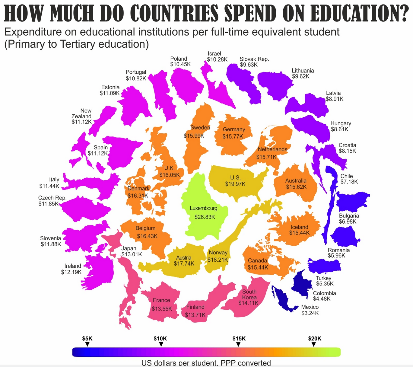
I'd much rather look a simple sorted table or a bar chart.
For me the country outlines don't add anything of value and they aren't too scale either with arbitrary rotations mixed in. Spending is on a strictly one dimensional scale yet the graphic implies some concentric (2-dimensional) pattern.